Designing a menu for a restaurant requires not only good design and creative efforts but also a deep understanding of the client and his actions.
Сlient looks at the menu only 109 seconds on average in order to make a choice. That’s why it has to “catch” the client from the first glance with a design and content.
The menu isn’t just a list of dishes and prices, it’s a complex marketing tool which able to stimulate a customer to make a certain choice.
We’ve made for you a list of the most common mistakes to avoid on menu design. Because they can directly affect staff performance and customer satisfaction.
1. Too template menu
A restaurant concept dictates not only standards and idea. The menu is its important component.
Do you have a restaurant with a unique story behind its creation? Share it with customers. Or maybe you have a theme cafe with a special story? Tell it. Perhaps you have jokes or stories related only to your place or employees? Everyone would love to read them.
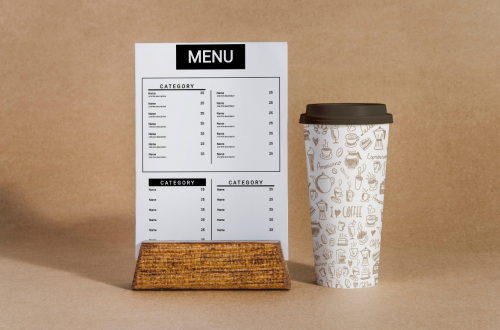
With free professional Waitron.MENU templates you can create a unique menu on your own.
2. Too wide variety of dishes
Too extensive menu is the most common mistake on menu design. It may harm a restaurant for several reasons:
- restaurant concept – if you have a Japanese restaurant, then burgers definitely won’t fit into your menu.
- employees’ workload – too extensive menu makes the working process harder for a whole team. It may also affect the quality of food and service.
- difficult customer choice – a huge number of pages on your menu will confuse customers, especially if they are in your place for the first time.
3. Lack of food descriptions
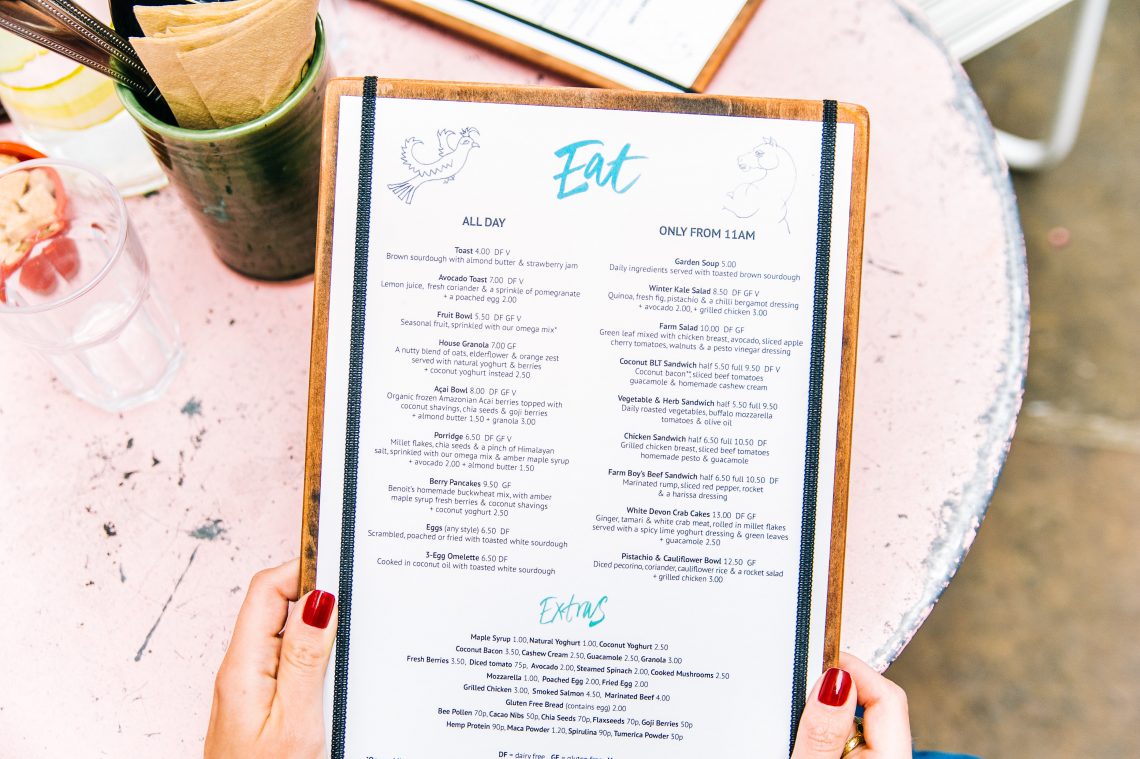
A menu without dishes descriptions and their ingredients makes customers feel uncomfortable. Besides, it takes more time for a waitress to take an order.
Give a short but interesting description of the dish. Describe it – hot, cold, vegetarian, with or without gluten. If the cuisine of your restaurant isn’t typical for your country, then we recommend paying special attention to the dishes description. Remember that not everybody knows what gazpacho or ceviche is.
4. Negligence to details
When writing a text and creating a menu design it is crucial to remember that details are very important. Something that you won’t pay attention to, the client will notice in the first place. Here is a list of details you should pay attention to:
- no matter how good your dishes are, the font, background, color, paper quality of the menu are important.
- there is nothing worse than reading errors or typos.
- the menu should complement the overall atmosphere, the size of plates and tables in the restaurant. It shouldn’t look too small on big tables or too large and uncomfortable to go through.
5. Lack of online menu
Before a visit, the majority of people firstly check out the restaurant’s menu on the Web. If you don’t have a menu posted either on the website or on social networks, you are at risk of losing some customers.
Create a unique menu by using templates, experimenting with fonts, colors, and descriptions, and share it online in a few clicks. All you need is to register on Waitron.MENU!


