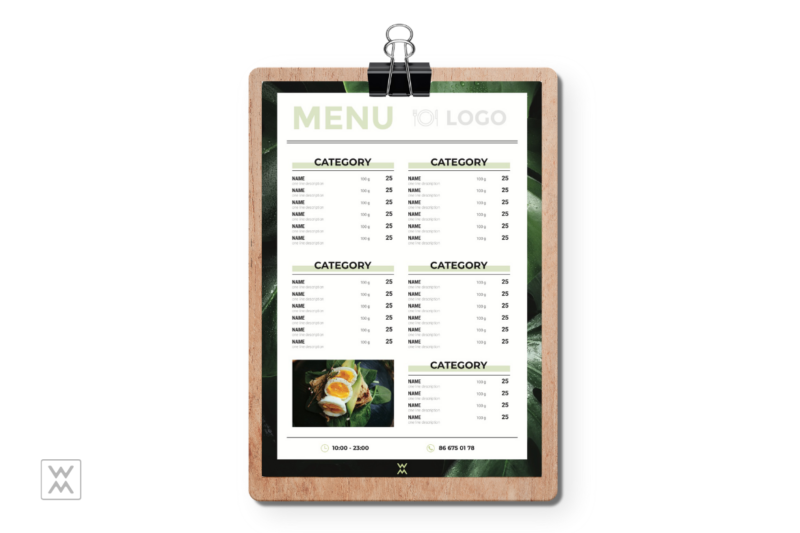
Every well-thought-out menu layout has to be visually attractive and convince guests to make certain decisions. The easiest way to make it so is to choose a harmonious color combination.
If you’re trying to design a menu yourself using online menu creators, we recommend you learn more about color harmony, its importance and ways to achieve it.
Color harmony in menu design means using color combinations that are pleasing for viewers’ perception. Such visual balance is crucial for effective and attractive design as well-organized colors have a positive impact on guests’ impressions from your restaurant or cafe.
However, there is one tricky thing about color perception: different people react to colors differently. The subjectivity is due to factors like gender, age, tastes, nationality, etc.
The easiest way to make attractive menu design for a restaurant to the majority of guests is using a few guidelines on how to achieve color harmony with the color wheel — a circle, built of primary, secondary and tertiary colors.
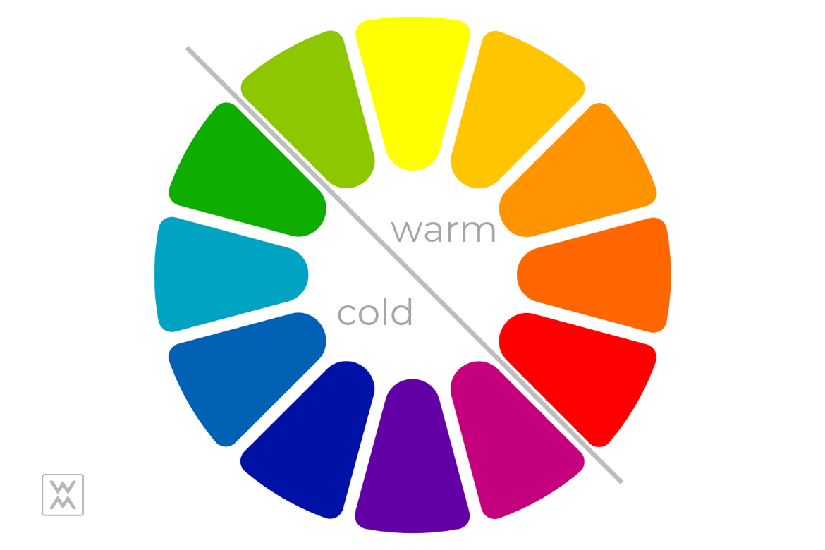
Here are some types of color harmony that you can get using this wheel:
-
Analogous Colors
Analogous colors are those that are located next to each other on the color wheel. If you’re creating a restaurant menu for the first time, try using this color scheme. As they are very similar, they work great together and create a harmonious visual effect.
-
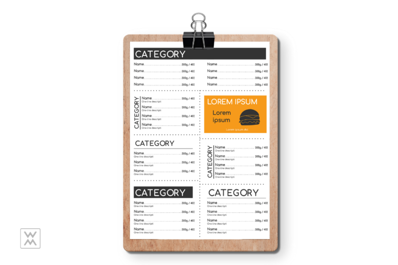
Complementary Colors
The complementary colors are those that are placed on opposite sides of the color wheel (a pair of warm and cold ones). To create a contrast effect in your menu layout, which we’ve mentioned in the article about the rules of a perfect composition, try these colors and their hues.
We recommend you using a warm one in the pair for the most important elements of your menu template to grab special attention to them (restaurant name, logo, names of categories or special offers, etc).
-
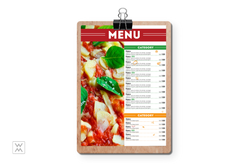
Triadic Color Scheme
If you’ve already had experience in creating a menu for a cafe or a restaurant and want to make a more interesting and well-balanced design, use the triadic color mix. This is a combination of three colors and their hues that are pulled equally from around the color wheel.
The most popular triadic combinations in menu design are orange-purple-green or red-blue-yellow.
If you are convinced that color harmony is the key point of a successful restaurant menu layout, try to create your stunning design right now. Waitron.Menu maker offers a great range of professional templates that will make the design process easy and enjoyable.