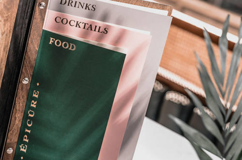
Menu design is one of the key elements of any successful restaurant or cafe. After all, it is a great marketing tool, that helps influence customers’ choice. That is why it’s important for your menu design to be not only beautiful but also well-thought-out.
Whether you create a menu design using an online editor or a professional designer, remember, that text is the exact element, which attracts a client’s attention in the first place. Here, we are sharing some tips, which will help you unmistakably choose the perfect font for your menu layout.
-
Have the limit of 2-3 fonts
This is the most important typography rule for novice designers. Use no more than 2-3 fonts in the same design, preferably fonts of the same category. Also, keep in mind, that font of different sizes and styles, if used in the same text, can destroy any good design.

-
Combine contrast fonts
Do not be afraid to combine fonts, which are opposite in style. A restaurant menu with two similar fonts looks boring. But if you decide on such experiments anyway, it is important to consider the rules, previously described in the article about font combinations.

-
Select a correct line length
In a restaurant menu layout, the most important point is an easy perception of the text. Hold the line lengths within 45-60 character. This is the most optimal number of characters for easy perception.

-
Forget about Times New Roman
A beautiful restaurant or café menu design is a great way to stick in your clients’ memory. That is why it is important for its design to be special and modern to the maximum. There are many beautiful and readable fonts except Times New Roman. Just find yours!

-
Use kerning and line spacing
Kerning is the process of changing the distance between letters. Use this technique in your menu design to make your font more readable. Also, try changing line spacing and see how your text becomes clearer.

-
Choose a font which looks good in any size
If you have decided to use only one or two fonts in the restaurant menu layout, make sure they are readable both in the category name and descriptions of the dishes. Pay maximum attention to handwritten fonts, which are less readable.

-
Avoid “widows” and “orphans”
While creating a restaurant menu, it is important not only to choose a good font but also to design it in a properly. y. There are concepts in a design known as “widow” and “orphan”. The only word in the line at the beginning of the block is called “orphan”. A word in a separate line at the end of the block is called “widow”. Try changing a kerning, font size, or deleting unnecessary words to balance the lines.

-
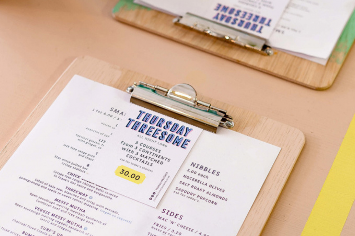
Do not write in capital letters
Text, written in capital letters, cannot be easily perceived by visitors. Use this set only in one line. For example, write the title of the restaurant or a category using capital letters.

An unskilful usage of typography can spoil even the most stylish menu design, as well as confuse your visitors. Use the above tips on how to choose a perfect font, and your menu will be not only stylish but also readable and professional.