The fact that you are not a professional designer does not mean that you are not able to create a stylish menu for your place by yourself. There is a wide variety of simple online-platforms for design everyone can learn how to use.
For example, try an online menu maker the Waitron.MENU. Choose a background, colors, and font, add your logo and photos of dishes. Does it seem difficult?
Our basic graphic design tips will help you to create the perfect menu without any designer.
1. Remember about visual hierarchy
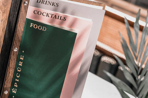
As in every text, there is a hierarchy of elements (heading, subtitle, sub-items) and in graphic design as well. This means that the most important element in your design has to be visually dominant.
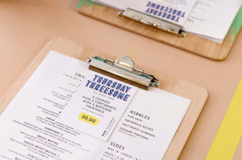
The hierarchy in the menu design is important in order to immediately direct the customer’s gaze to the necessary details. Otherwise, you are at risk of dispersing customers attention. Size, color, spacing, and grouping of elements are the things that will help to provide details with visual importance.

2. Balance readability with a style
This tip is primarily related to fonts. Of course, there are many complex rules and techniques of typography (font art, whose importance has been highlighted previously in one of our articles). But for non-designers, we came up with one simple rule that always works.
Balance readability with a style. And use only 2-3 fonts. Usually, stylized fonts are less readable, but it’s not necessarily mean that they should be discarded. The perfect formula for the menu: 1 stylized font for headings + 1-2 readable fonts for the main text. More tips find in an article about combining fonts.

3. Carefully consider a color scheme
Choosing a color among millions of shades isn’t an easy task. But there are some simple rules and techniques that can be applied by a non-designer. With colors you can apply the same rule that works with fonts – 2-3 colors are enough.
What colors to choose for your menu? If you already have a logo and a corporate color, then everything is so simple. But if you want to start over from scratch, then you need to choose the right color scheme.
Today there are many platforms ready to help you with this. Here are some of them:
- Color Hunt – service with ready-made color combinations
- Coolors – online-generator of color schemes
- Color Combos – a service-library of color schemes

4. Follow the rule “The simpler, the better”
Having learned a lot of new techniques and design skills, you immediately think about applying all of them to your menu. We highly recommend not to do this.
A menu design should match with its text and complement it. Focus on the ideas of your restaurant and the kitchen. Focus customer attention on the concept of your place and its cuisine.
When you finish with a design, check it again and ask yourself the following questions:
- What can be removed to make the design simpler?
- Is there a visual hierarchy?
- Is there a balance between applied fonts?
- Do the colors match and correspond to the concept of the place?
To better understand and remember our tips, you need to try them out. Create your perfect menu in a few clicks – sign up for Waitron.MENU!