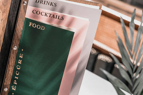
Nowadays creating a menu design with own efforts is no longer a difficult and baffling task. The availability of easy-to-use online editors, free templates and training video materials allows quickly and easily to get things done. However, to create a really unique and “clinging” design it is important to lean on basic design rules.
In this article, we’ll talk about 4 simple rules that will help you to break ground in the creation of your ideal layout.
Focusing on an essential element
In order to have an integrated and clear menu design, it is important to focus on a particular element. How to choose the focus? Keep in mind that the main purpose of design is communication with the one for who it is created. The most important element should disclose an idea or cause a certain emotion. Visual hierarchy is exactly what you need.

The Rule of Thirds
In order to have an extraordinary design, beauty isn’t enough. A good composition should be visually balanced and simple to perceive. There is one simple principle that will help you with this – the Rule of Thirds. The principle states that as a guidance it is better to use grid 3×3 breaking the design into three equal horizontal and vertical sections.
First of all, this sheds the light on a symmetry of your menu design and on the elements arrangement. Secondly, intersection lines are perfect for placing major elements. The closer the object is to intersection, the more it draws attention.

Application of contrast effect in design
If you’ve ever created menu design yourself, then for sure you had to wonder how to make it authentic and eye-catching. To do so it is not necessary to apply complex color combinations or elements. Just the right contrast is enough. It is not only a matter of color contrast. The contrast is a variation between two elements. We recommend experimenting with such contrasts: dark/light, thick/thin, big/small.

Duplication of design elements
Sometimes having a desire to create a totally unique design, you can create many different elements that don’t match. This puts you at risk of creating an inharmonious image. We know a solution – don’t be afraid to duplicate some elements. First of all, that’s a way of creating your own style. Secondly, it is a perfect method of creating a logically connected design of several pages.

It should be realized that there is no unified universal rule of good design. Because the creation of the unique design is a difficult and long-lasting process. But even a beginner will be able to deal with this task. The only thing you have to do is to experiment with shapes, elements and apply above mentioned rules only where appropriate.


