How to make a restaurant menu? This is a constant question, which every restaurateur asks himself after creating a new menu for his establishment. You can use a designer service, or create a menu layout yourself. But you should never forget the basic rules of graphic design.
Сomposition is the exact element, which makes your menu layout structured and understandable for a visitor. We have chosen five key rules for you to consider:
-
Scaling and hierarchy
As we mentioned earlier in the article about the tips for non-designers, visual hierarchy and scale are important to immediately attract a customer’s attention to important details.
To make his choice, a client looks in the menu for approximately 109 seconds. That is why this rule is especially important in a restaurant or café menu design.
In the menu template below, you can see how names of categories and dishes, their descriptions, are separated with different font sizes.

-
Balance between elements
Designing a menu, it is also important to consider the balance between elements, in order not to make its layout too difficult for perception, or too empty.
There are two types of balance: symmetrical and asymmetrical. In the first type, elements are displayed on both sides (right-left, top-bottom).
Asymmetrical balance is more complex to execute, but it will look much more interesting in a menu layout. A good example of such balance is this template.

-
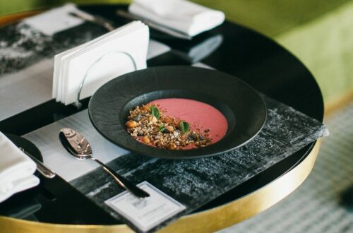
Elements, which complement one another
The most common mistake in a design is the use of elements, which are not compatible. As a menu design often includes not only text but also photos of dishes and other graphic elements, you should pay attention to this rule.
Always use pictures from the same photo shoot or images of the same color range on your menu. This is an incredibly easy way to make sure that elements are compatible. This menu sample will help you understand what we are talking about.

-
Contrast
Contrast is an incredibly useful help for highlighting particular elements of your design. By enhancing the contrast with color, texture or size, you can draw attention to a particular object.
Visual emphasis in menu design is a great way to increase sales of a particular dish or category. One category of dishes is highlighted in yellow in this black and white menu template. Thus, a visitor may pay special attention to it.

-
White space
White space is a technique, used in a graphic design, which denotes space (not necessarily white) free from text, pictures, and lines.
If you want to make your menu visually easy to read, deliberately leave empty blocks in it, as shown in the menu template below.

While creating the right composition in a menu layout, it is important to pay attention to many details. If you are still a novice designer, you will have to put a lot of effort and spend much time trying to systematize objects. Use five listed rules, and your guests will appreciate the effort.