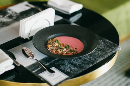
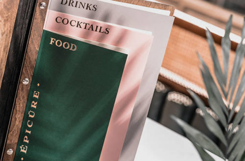
It doesn’t matter whether you run a luxury restaurant or a small cozy coffee shop, menu creation is one of the most important processes. When you design a menu, you need to consider two details: it has to be visually attractive and at the same time easy-to-read.
To do a menu so isn’t hard – you only need to know the basic principles of combining fonts. The art of proper text design is called typography. This topic is covered in the article on key terms in design.
Fonts are divided into many types. But there are three main ones beginner designers should be able to distinguish.
1. Serif Fonts
Serif fonts are the most classic ones. They are used in most documents and design materials. One of them is the very well-known – Times New Roman.
 2. Sans Serif Fonts
This type of font is more simple and modern than serif fonts. It is easier to read due to the lack of details. It is perfect for small-sized text.
 3. Handwritten Fonts
The name itself makes it clear how this font type looks like. Handwritten fonts are not suitable for writing long texts, but they are perfect for headings. This font type is the simplest and most beautiful decorative element.
3 principles of combining fonts
Create a proper menu design is possible if you follow these three main principles of combining different font types. There is no doubt, using these principles you will definitely hit the mark.
The font is one of the most important details of the menu. Do you want your menu to be stylish, but at the same time easily perceived by guests? Try to follow our pieces of advice and turn an idea into reality — create your menu with an online menu maker Waitron.MENU!


