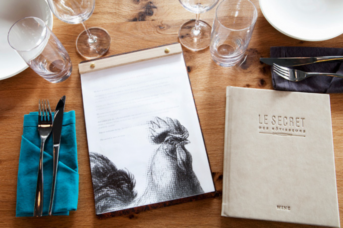
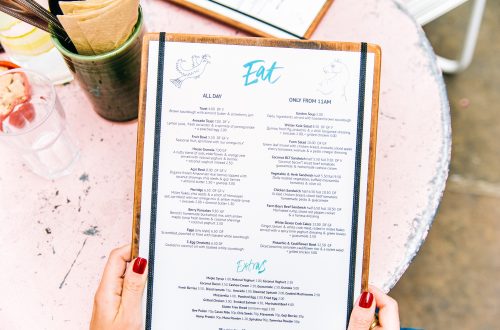
The creation of stylish menu design is no longer a problem for restaurateurs since you can accomplish this task yourself using a wide selection of online menu makers.
This method will help to significantly reduce budget spends, and with a competent approach, your menu layout will be as good as a professional one.
In today’s article, we will talk about the most common mistakes of designers-beginners and how to avoid them.
1. Following modern trends
To create a menu that will be truly trendy and modern, it is important to keep up with the latest trends. But blindly following the trends is not recommended.
Analyze and choose those trends that correspond to the concept, branding and most importantly the target audience of your restaurant.
2. Words instead of visualization
The key rule of a good design is less words, more visualization. Using this rule, your menu template will be as clear as possible for guests and easy to perceive.
We recommend replacing clarifications or notes with graphics in menu design. For example, make illustrations of coffee cups explaining the difference between drink types. More ideas you can find in the article about icons in design.
3. The absence of a coherent style
A huge mistake that designers-beginners often make is the absence of a coherent style. In this case, you risk creating a design without a clear idea and concept.
That is why it is a great idea to use ready-made templates when creating a menu for your restaurant or cafe. A gallery of professional templates you can find in the Waitron.Menu maker.
4. Typos and mistakes in the text
Remember that people pay attention to details and what you might think is a trifle, guests will notice in the first place. Carefully check the spelling of words on your menu, especially if it contains authentic names of the dishes (Italian, Japanese and others).
5. Bad font choice
Most designers-beginners believe that a font is a part that is not worth much attention. But in fact, it is as important element of design as composition, colors or graphics.
We recommend you using no more than 2 fonts on the menu: one handwritten or serif for the names of categories or dishes, the other – simple and readable for descriptions and other small text.
6. Design that only you like
When creating a menu, always remember that you are developing a design for your guests, not for yourself. Focus on the tastes and preferences of the target audience to achieve the desired result from your menu.
We also recommend trying to implement the ideas described in the article on the psychology of menu design.
In order to avoid mistakes, you just need to know about them. Now you are armed with all the knowledge necessary to create the right menu on your own.


