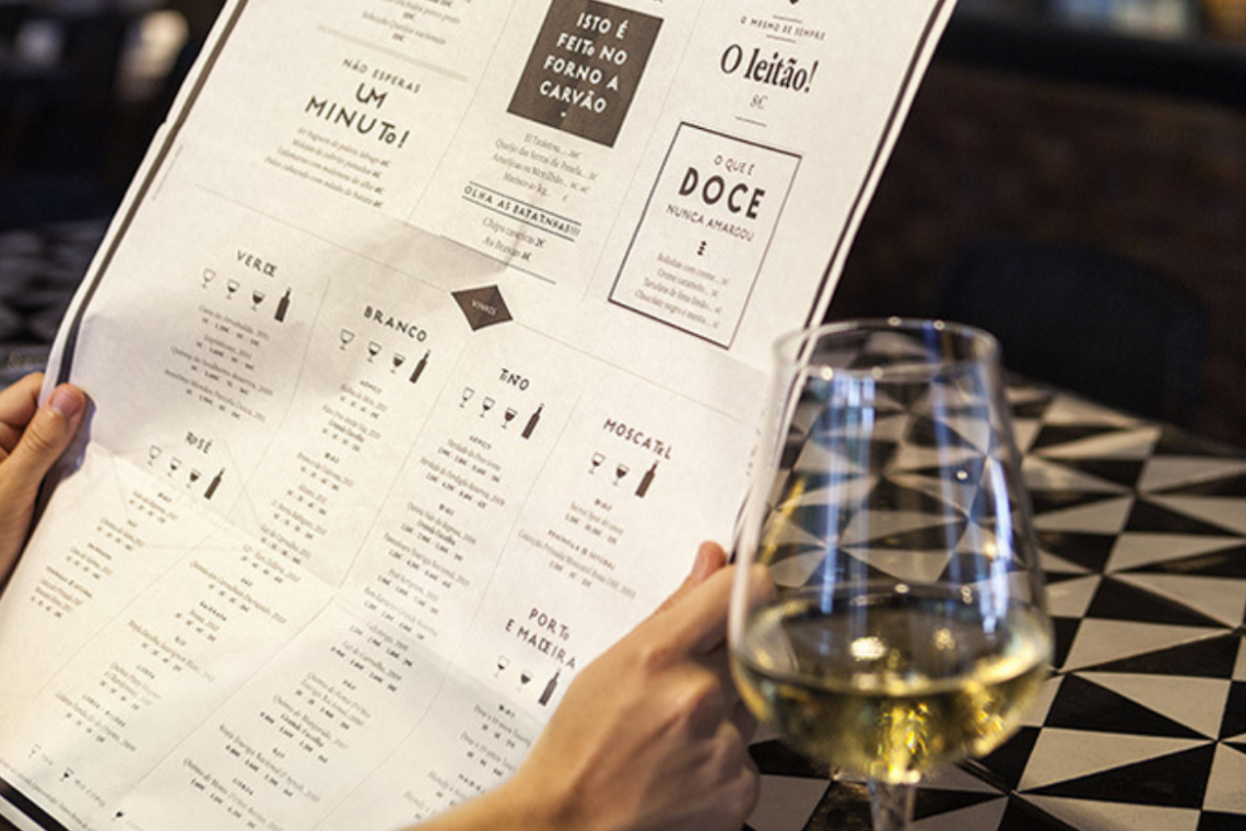
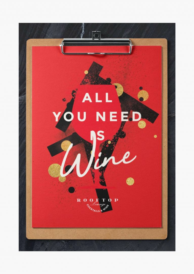
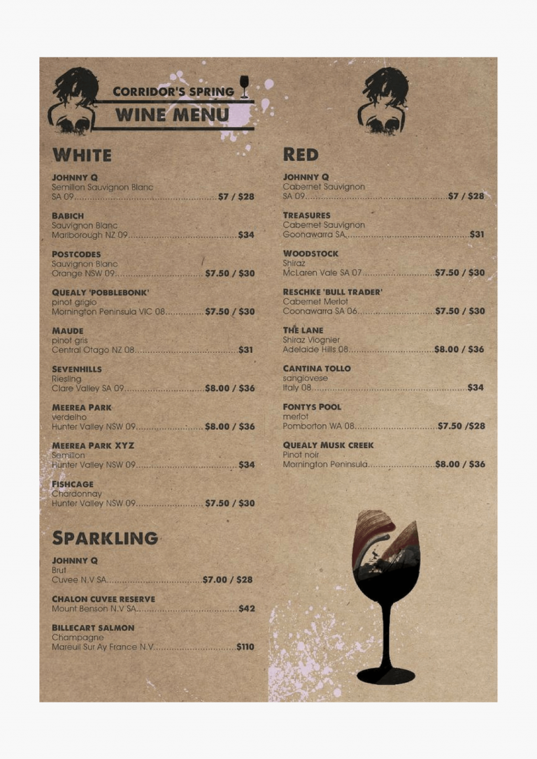
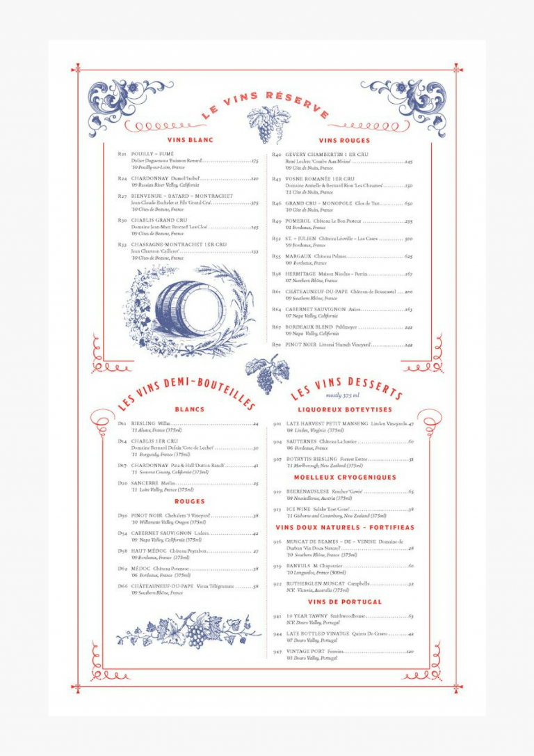
Creating a really good wine card requires significant financial and time expenses. In many cases, if your menu design is not created properly, purchasing elite wine may be a waste of investment.
What should the “working” wine card be like? We have selected the best tips and examples, which will inspire you for stylish and thoughtful menu design.
-
Never sort wines by price
Sorting wines from the most expensive to the cheapest or vice versa in a restaurant menu is not a good idea. This will make your customers intuitively choose the cheapest ones.
If you want your visitors to try wines of a different price range, then you have to organize them properly, without paying attention to the price. In the end, when the price is not the main factor in the card, it will also be less significant for customers.
-
Classify wines in categories
We do not recommend you to create a continuous list of wines without categorizing them. It will be difficult for customers to find a certain type of wine, and they will prefer to order something else.
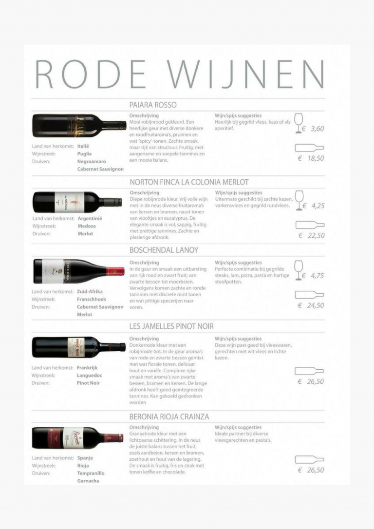
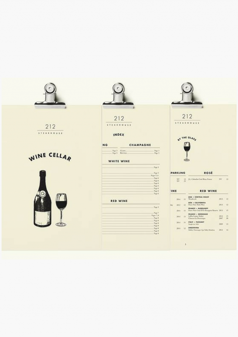
While dividing wines into categories, select one criterion and stick to it. For example, arrange wines due to their color (red, white, pink), taste (dry, semi-dry, semi-sweet, sweet), country of origin.
-
Label the best wines
Add visual tags to your wine card layout to highlight selected or collectible wines. Stars, circles or other symbols will draw customers’ attention to the specific type of wine.
What wines to label? The most profitable or special ones, which are available only in your restaurant and you want to focus on them.
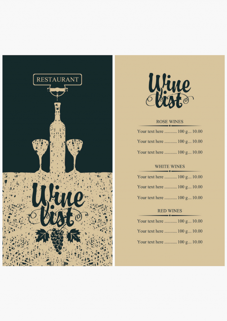
Menu design. Six examples of a wine card
Beverages always take the most marginal positions in any restaurant. Therefore, each restaurateur must take care not only of a wine collection but also of a stylish and discreet wine card design.
