Whether you run a luxury restaurant or a small cosy café, creating a menu is one of the most important moments. Despite the fact, that the spheres of the restaurant business and design are constantly developing, stereotypes and fishy stories about the creation of a menu design still exist.
In today’s article, we will talk about the most common myths and why you should not believe in them.
1. Menu design is not that important
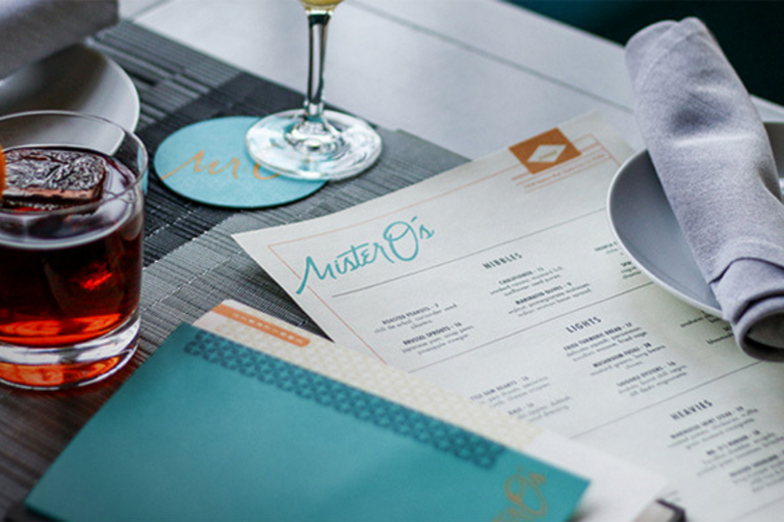
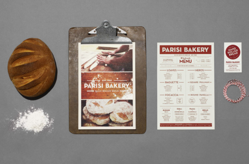
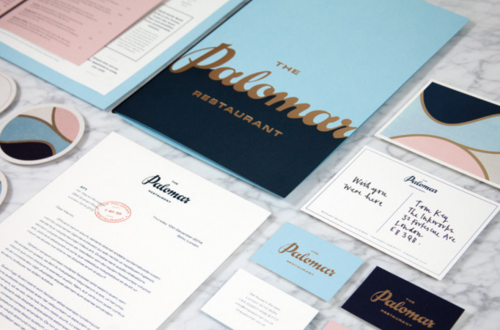
A menu has been more than just a list of dishes and drinks for a long time. A menu design should reveal the idea and concept of the establishment, complement the interior and, most importantly, encourage visitors to order as many dishes as possible. Thoughtful design is what can actually turn a simple list of dishes into an effective marketing tool.
2. It is impossible to create a decent menu without a professional designer
Until recently, this statement could be accepted as truth. But with the development of the restaurant industry, many online programs for creating menus have appeared. And that is how this task has become possible to accomplish for almost everyone. All you need is a little time, inspiration and an account on Waitron.Menu.
3. More items on a menu equal more sales
This myth works exactly the opposite: the more dishes on the menu, the harder it is to make a choice. When designing a menu, it is important to keep focused and laconic. If you find it difficult to determine the optimal size of the menu, use the “Rule of the Golden Seven”, which we described in the article about the secrets of menu design.
4. Everyone should find the design appealing
Are interior, kitchen and menu design of the place created to be liked by everyone? It is not like that at all. Think of your own concept of the establishment and stick to it to the smallest details. Only in this case, guests will come to you and will feel special, and, as they say, in the right place.
5. The font in a menu layout should be simple
Obviously, a menu should be well-readable. But this does not mean, that it has to be simple and boring. If you want to make a menu yourself, keep two rules in mind. First of all, never use more than three different fonts. Secondly, combine contrasting fonts in your menu template. More tips can be found in the article about the perfect menu font.
6. It is enough for a menu to be visually appealing
If you think, that the main task of a menu is to appeal to visitors, then it is enough for it just to be stylish. But, if you want your restaurant menu design to “sell” and encourage customers to come back again and again, you need to try a little harder. We recommend to study the subtleties and rules of a menu engineering (the science of a competent menu creation) and apply them to your design.
7. Price is the only changeable thing on a menu
In order for the sales of your establishment not to stand still and grow all the time, it is necessary to analyze the effectiveness of a menu. Every three or six months, evaluate the profitability of each dish and make changes. For example, if one category sells worse than others, it is necessary to visually highlight it in a menu layout with a colour or a frame.
8. Photos on a menu increase sales
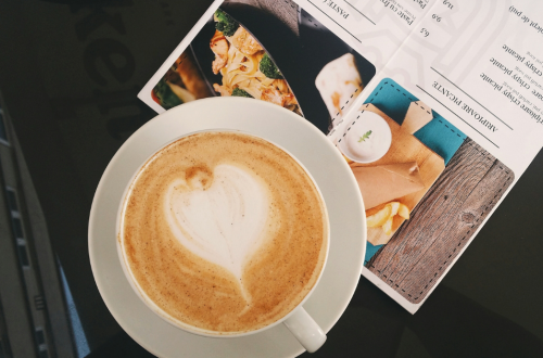
A photo on a menu is a rather controversial issue. On one hand, such menu design should awaken an appetite, but on the other hand, your establishment may be associated with a low-quality one. If you do decide to add photos of the dishes to your menu template, then they should be accomplished in the same style, colour range and a very small amount.
If you want to create a truly original menu, you should not pay any attention to various kinds of stereotypes. Learn to look at a menu design process in an original way. And the tips, which we have already mentioned above, will help you with it.


