Well-thought-out menu design is not just a detail, but an important component of a successful restaurant or café. Even the tiniest thing should be taken into consideration: font, color, text, selection of photos and graphics.
In our today’s article, we will tell you about key rules of choosing an appropriate color range in a menu layout, as it is a powerful tool, which can affect your customers’ associations, emotions, appetite, and impression.
1. Use brand colors
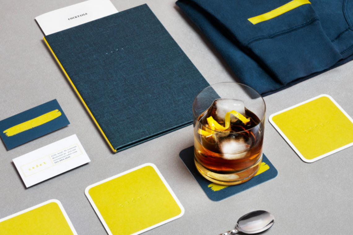
Your menu is a perfect representative of the style of your establishment. Customers remember not only its name and logo but also colors. When designing a menu, use a brand color palette. If your colors are too bright, use them as a color accent.
2. Choose the right associations
Each color evokes certain associations. For example, a particular color may be associated with a particular type of food or place. Are you an owner of a vegetarian café? Try green in your new menu. Coffee shop? Pastel brown shades are perfect for you. Look for more examples in the article about menu design of a coffee shop.
3. Apply the technique of psychological impact of colors
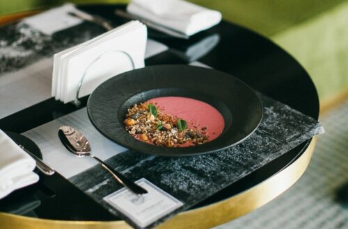
It is no secret, that color can affect our mood, well-being or even appetite. Use this fact while creating the menu of your restaurant or café. For instance, it has been proven that red and orange shades arouse appetite, and the blue ones diminish the feeling of hunger.
We have made a selection of the most popular colors and sorted out the meaning and influence of each of them:
-
Red color
Psychological effect: It is proven that red color affects the excitability of the human nervous system more strongly than any other. If you look at red for a while, your breathing and pulse speed up.
In menu design: Since red color also increases appetite, many restaurants and cafés use this tip and add this color to the interior, brand elements or menu template.
We recommend you to use this color in design very carefully, as the intensity of red may cause incorrect or even aggressive emotions. Be sure to add calmer shades to your menu for some balance.
It goes well with black, white, blue, yellow, green.
-
Green color
Psychological effect: Most people associate green with balance, harmony, and peace.
In menu design: Talking about food, this color represents freshness, organicity, and naturalness. That is why you will find it in the menu layout and interior of a vegetarian or vegan café.
In Waitron.Menu online editor you will find many templates, which use the best combinations and shades of green.
It goes well with yellow, white, grey, brown, beige.
-
Blue color
Psychological effect: In general, the blue color evokes positive associations: peace of mind, inspiration, and reliability.
In menu design: It is known that blue suppresses appetite and, accordingly, it is not recommended to use this color in the interior and menu design of a restaurant or café. But the right choice of its hue and a successful combination will help create an elegant and discreet menu.
It goes well with blue, white, grey, brown, red.
So, did we manage to convince you, that a rightly chosen color on the menu can significantly affect your visitors and, accordingly, your sales? Then arm yourself with our tips and create a new effective design right now!


